Crafting Consistent and Scalable UIs with Figma: A Guide to Design Systems
9jatechbros
- 1
- 79
In today’s fast-paced digital world, creating user interfaces (UIs) that are both consistent and scalable is crucial for maintaining a high standard of design quality. One of the most effective tools for achieving this is Figma, a collaborative interface design tool that has taken the design world by storm. But how do we use Figma to build design systems that ensure our UIs are consistent and scalable? Let’s dive into the world of design systems and discover how Figma can help us create beautiful, functional, and cohesive designs.
What is a Design System?
A design system is a collection of reusable components, guided by clear standards, that can be assembled together to build any number of applications. It’s not just a style guide or a pattern library; it’s a comprehensive resource that includes everything from typography, color schemes, and iconography to more complex UI elements like buttons, forms, and modals.
Why Use a Design System?
Using a design system offers numerous benefits:
– Consistency: Ensures all parts of the application look and feel cohesive.
– Efficiency: Speeds up the design and development process by reusing components.
– Scalability: Makes it easier to scale the design as the application grows.
– Collaboration: Enhances collaboration between designers and developers.
Why Figma for Design Systems?
Figma stands out as an ideal tool for creating and maintaining design systems due to its collaborative nature, ease of use, and powerful features. Here’s why Figma is a great choice:
1. Real-Time Collaboration: Multiple team members can work on the same file simultaneously.
2. Component Libraries: Allows designers to create and manage reusable components.
3. Cloud-Based: Access your work from anywhere without the hassle of version control.
4. Prototyping: Create interactive prototypes without needing to switch tools.
5. Plugins and Integrations: Extend Figma’s functionality with a variety of plugins.
Getting Started with Design Systems in Figma
To build a design system in Figma, follow these steps:
1. Plan Your Design System
– Identify the components you need: buttons, forms, navigation, etc.
– Define your design principles and guidelines.
2. Create Your First Component
– Start with the basic components like buttons. Create different states (default, hover, active, disabled).
– Use Figma’s component feature to make these elements reusable.
3. Establish a Style Guide
– Define typography (font sizes, weights, line heights).
– Set up a color palette with primary, secondary, and neutral colors.
– Create guidelines for spacing and layout.
4. Build a Component Library
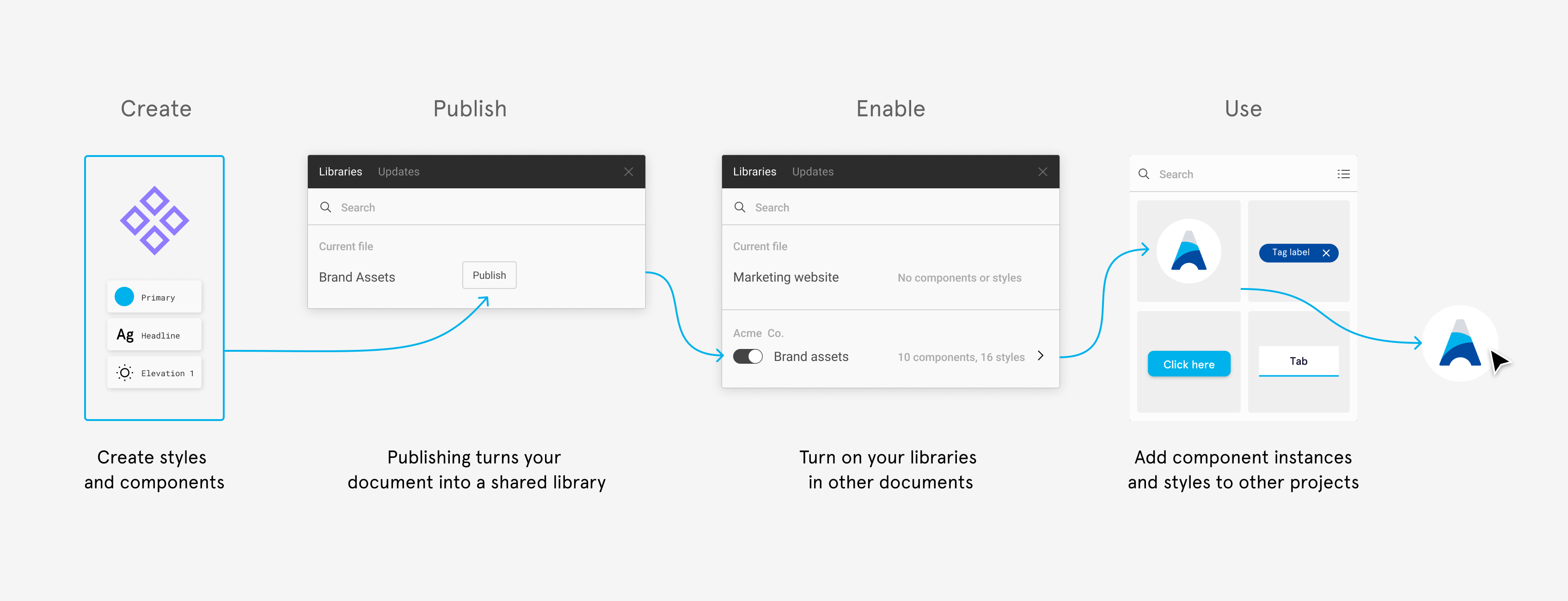
– Organize your components into a library. Figma allows you to publish libraries that other files can use.
– Group similar components together for easy access.
Maintaining Consistency with Figma Components
Figma’s component system is key to maintaining consistency. Here’s how to use it effectively:
– Create Components: Select an element and convert it into a component. This makes it reusable across your design.
– Use Instances: Drag instances of your components from the library to use in your designs. Changes to the master component automatically update all instances.
– Nested Components: Components can be nested within other components. This is useful for complex UI elements.
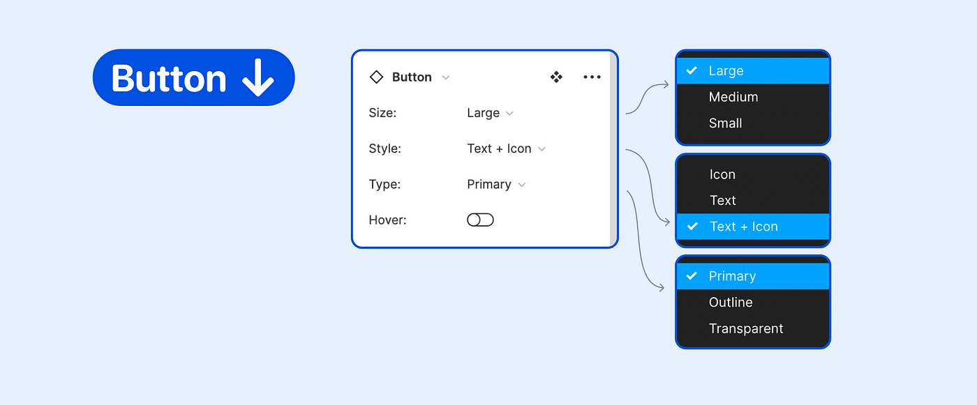
– Variants: Use variants to group different states or versions of a component. This helps in managing similar components together.
Prototyping with Figma
Figma also offers powerful prototyping capabilities. Here’s how you can use them to bring your design system to life:
– Link Components Create interactive prototypes by linking components to different frames.
– Interactions and Animations: Add hover states, clicks, and other interactions to make your prototypes more realistic.
– Test and Iterate: Share your prototypes with stakeholders and gather feedback. Iterate based on the feedback.
Collaboration and Handoff
One of Figma’s biggest strengths is its collaborative features, which streamline the design-to-development handoff process:
– Real-Time Collaboration: Designers and developers can work together in real-time, reducing the feedback loop.
– Design Tokens: Use design tokens to bridge the gap between design and code. Tokens can include colors, typography, spacing, etc.
– Developer Handoff: Developers can inspect elements, view CSS properties, and export assets directly from Figma.
Scaling Your Design System
As your application grows, so will your design system. Here’s how to manage and scale it effectively:
1. Regular Audits: Periodically review your design system to ensure it remains relevant and efficient.
2. Documentation – Maintain thorough documentation for every component, guideline, and best practice within your design system.
– Use tools like Confluence or Notion to create a living document that is accessible to everyone on your team.
3. Version Control:
– Keep track of changes and versions of your design system. This ensures that everyone is using the latest components and guidelines.
– Figma allows you to create branches for exploring new ideas without affecting the main design system.
4. Feedback Loop:
– Encourage team members to provide feedback on the design system.
– Create a process for reviewing and integrating feedback to continuously improve the system.
Case Study: Using Figma at Scale
To illustrate the effectiveness of a Figma-based design system, let’s look at a hypothetical case study. Imagine a tech company, TechBro Solutions, that uses Figma to build and maintain their design system.
Scenario:
TechBro Solutions has a suite of products, each with its unique requirements but a shared visual language. They needed a design system to ensure consistency and streamline the design process.
Implementation:
1. Component Creation:
– They started by identifying common UI elements across their products, such as buttons, input fields, and navigation bars.
– Each component was meticulously designed, with states and variants to cover different use cases.
2. Style Guide:
– A comprehensive style guide was created, covering typography, color schemes, and spacing.
– Design tokens were used to ensure consistency between design and code.
3. Prototyping and Testing:
– Prototypes were created to test the usability and functionality of the components.
– Feedback was gathered from users and stakeholders, leading to iterative improvements.
4. Documentation and Training:
– Extensive documentation was created to help team members understand and use the design system.
– Training sessions were held to onboard new designers and developers to the system.
Outcome:
– Consistency: The design system ensured a consistent user experience across all products.
– Efficiency: Designers could quickly assemble new interfaces using the pre-built components, saving significant time.
– Scalability: As new products were developed, the design system scaled seamlessly to accommodate them.
– Collaboration: Designers and developers worked more effectively together, reducing the time and effort required for design handoffs.
Conclusion
Building a consistent and scalable UI design system in Figma is a powerful way to enhance the quality and efficiency of your design process. By leveraging Figma’s collaborative features, component libraries, and prototyping capabilities, you can create a robust design system that grows with your needs.
Whether you’re working on a small project or a large suite of applications, investing in a design system will pay off in terms of consistency, efficiency, and scalability. Start small, document everything, and continuously iterate based on feedback to build a design system that truly meets your needs.
By following these guidelines and utilizing the power of Figma, you can create a design system that not only enhances the quality of your UI but also improves collaboration and efficiency within your team.



Thanks for sharing. I read many of your blog posts, cool, your blog is very good.